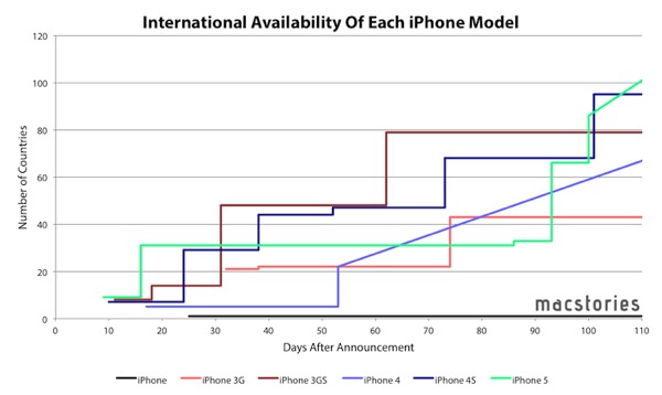
Graham Spencer at MacStories has a fantastic look at Apple’s iPhone and iPad rollout timelines. The pattern, when you look at it, makes it somewhat obvious that Apple has their iPhone rollouts down to a science. And based on what he’s seeing with the iPad, they’re getting better at Day 1 availability. Check out the full post for more graphs and maps which supports some great commentary.
One thing I’d like to point out is how the iPhone’s rollout has been relatively stable for the past several years. However, the iPad’s rollout has grown dramatically in the last two iterations. I’m confident it shows how important the iPad is to Apple’s continued growth in a Post-PC world and a comment to how low the barrier to entry the iPad has compared to the iPhone where carrier approvals can get in the way.